Apple has released its newest iPhone and iOS 7.0 mobile operating system recently, so there has been a lot of breathless media coverage on smart phones.
Beyond the Apple vs Android battle, it is worthwhile to think about the massive mobile penetration across our lives. And as business people we should all be asking ourselves if we are focusing enough on our mobile to serve our customers and impact our business.
Let’s start by taking a look at some numbers on mobile (note that mobile is defined as smart phones and tablets).
Some eye-catching numbers on mobile:
I just finished up a mobile commerce project and came across some illuminating statistics:
ACCESSING THE INTERNET
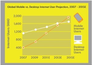
Since the web became huge in the mid 90’s (remember Netscape?), desktops and their cousins, laptops, were the major ways we all accessed the internet. And we loved it when large screens became affordable (a 21 inch screen was a terrific size to surf the web). But while monitors are cheaper than ever, we don’t access the web in the same way now.
Consider:
- In 2014, mobile devices will become the most common way for people to access the internet. In other words, more people will access the web via phones and tablets than with desktops and laptops.
- 25% of web users now only access the internet via mobile. So if your company’s web offerings appear decent only on desktop screens, you will be excluding 25% of your customers who only use mobile.
Email continues to be a major way businesses communicate with their customers. And mobile is playing a larger and larger role with email:
- The majority of email (52%) is being opened on mobile now
- 43% of mobile email users check email at least four times a day
- 70% of recipients delete an email if it doesn’t look good on their mobile devices
The last bullet is particularly important as we need to be sure our messages are compelling on these smaller devices. If they are not, we are likely to fail in communicating the message.
MOBILE COMMERCE
There has always been the question of whether buyers would be interested in purchasing on mobile devices. The answer is clearly becoming: “yes, people will purchase on their mobile devices.” Consider this:
- 80 million U.S. consumers (or 51% web users) will make a purchase on a mobile device in 2013
- Mobile will make up 24% of eCommerce sales by 2016
So what should you be doing with your mobile web strategy?
1. Consider how your customers interact with you when online
More than likely, a significant and growing portion of your traffic (greater than 25% and perhaps 50%) is coming through mobile devices. You will certainly want to look at your web analytics to identify how much.
Once you confirm this usage, consider whether to offer your customers a mobile friendly website or a mobile application or both.
In most cases, a mobile-friendly website is where you should start since all users have a mobile browser built into the device. Mobile applications need to be downloaded on their own, but are particularly good if your customers can use it to solve an important need (for example, online banking or checking in for your airline).
If you don’t have a mobile-ready site, don’t fret. A recent study by Marketing Sherpa found that only 34% of businesses have a mobile friendly site.
2. Use a “mobile first” strategy
“Mobile first” is a design strategy used by many companies including Google and Apple where they design for the smallest screens first (typically smartphones) and then focus on larger screens.
The benefit to this approach is you are likely to have a much more satisfying user experience on your mobile devices when you make it your top priority. And It is always easier to design with extra space.
3. Consider responsive design
Responsive design is an approach where a single set of software is developed that can determine the size of the screen and present a view that is optimal for the user. The result is that the user’s experience is much stronger than if there were one version of the design. This tailored presentation should lead to more satisfied users and sales on your site. Also, maintaining one set of software code is a big plus.
Here is an example of Yankee Candle which has presents different views based on screen real estate.
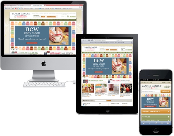
Yankee presents different views of their web pages based on the size of the screen – leading to a more satisfying user experience.
4. Aim to design your emails in mobile friendly formats
Since a majority of emails are being opened on mobile device, you should aim to make these digital communications mobile-optimized.
The same Marketing Sherpa survey found that just 42% of marketers are optimizing emails for mobile. So you are not alone if

On the right is an email from Twitter that is optimized for mobile.
you are not creating mobile-optimized emails.
If this is the case, consider these steps to improve how your emails will appear on mobile:
- Your emails should be sized down- scale to 320-550 pixels wide
- Calls to action need to be particularly clear and your text is concise
- Your text should be large (Apple recommends font sizes of 17-22 pixels and headlines to be 44 pixels) and email safe (Tahoma is a good choice)
- Images should be used in moderation (images are often blocked by browsers)
Mobile is growing fast and will soon become the major screens through which we consume digital information. If you have not yet done so, you should consider how your marketing is going to adapt to this new mobile world.
