It’s January and like so many of us I am thinking about my New Year’s resolutions. One of mine is to get into better shape.
My wife is a big supporter of this goal, and she bought me a membership to a new gym in Pittsburgh’s East Liberty neighborhood called Orange Theory Fitness.![]()
They run 60 minute cardio- strength classes. The Orange ties to the ideal color on the heart monitor color spectrum where participants get the ideal workout – not too intense, not too gentle. And here’s the big payoff- exercisers who stay for a certain number of minutes in the orange during the workout continue to burn calories up to 36 hours after a workout. What’s not to like.
Orange Theory Fitness Branding
The Marketer in me is impressed with the consistent and on-target branding throughout the business. Everything fits together well- from the color tones to the messaging to the monitors.
Consider this:
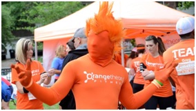
- The core color Orange ties to one of firm’s big benefits – high calorie burn both during and after the workout. Those people in oraange below are maximizing their workouts.

- The choice of orange is also appropriate as “Cheerful orange evokes exuberance, fun and vitality.”
- The stylized “O” in Orange also portrays activity and forward movement. I have been critical of other logos (see post), but this one does pretty well. One suggestion about the firm’s long name: I would cut the word “theory” – it’s not needed.
- The color ties to the workout space, signage, merchandise, and promotional items.
At the end of the day, the success of the business will be predominantly determined by satisfied customers who feel that they are getting the workouts (and calorie burns) they seek. Yet business has started well as the brand story and product fits well together.