One of the fun parts of my job is working on branding and new company logos.
There is a lot that goes into branding. While many components of branding are not explicitly visual (think positioning), a company’s logo is very visible. It is hanging out there for everyone to adore or abuse.
I have certainly been part of creating some great logos, as well as some more forgettable ones.
But let’s have fun. Here are some of the logos I have come across that are more than forgettable – they are downright awful.
1. Kids Exchange
Sometimes a lack of punctuation can be a problem.
![]()
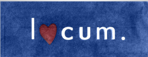
2. Locum, a Swedish real estate company
Language can be a barrier. This logo does not translate well across the Atlantic.
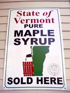
3. State of Vermont
Governments are notoriously bad with logos (think: the postal service). I am not sure what the designer of this logo was thinking.
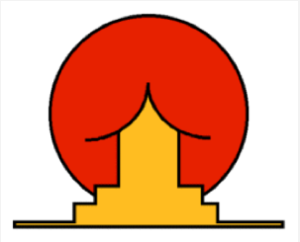
4. Sunrise Sushi
The concept is a sun rising behind a Japanese tea house. But when these two images are pulled together in a poorly designed logo, one groans.
5. 2012 London Olympic Games
Opinions were mixed here. Many were unimpressed with this logo that cost over $500,000 to develop.
Critics claimed the logo depicts the Simpsons involved in inappropriate behavior (can you see the outline of Lisa?). Some saw a swastika.
And even Iran was unhappy and threatened to boycott the 2012 Games because they claimed the logo spelled Zion.
![]()
Now on the flip side… there are companies doing good redesigns of older logos. Here are a few technology-based companies that had nice improvements.
1. Motorola
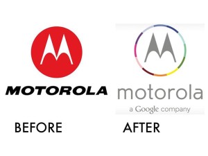
Google purchased Motorola for $13 billion a couple years ago. The search giant successfully maintained Motorola’s connection to its past with the stylized M while weaving in Google’s colorful presence. Nicely done. Note: Google recently sold Motorola to Lenovo, so you won’t see this logo for much longer.
2. Spotify
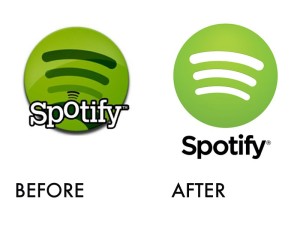
Spotify’s old logo was goofy (perhaps deliberately so). Their new san serif logo is clean but still has some of the fun elements of the old logo.
3. SnapRetail
And from my own personal files, here is a logo we evolved at SnapRetail over a couple years.
Our first logo was bold and “snappy” with its bright red color and movement over the “s.”
![]()
The 2nd version was more refined, had richer colors, and a sturdier feel. It feels like a more established company.
![]()
Company logos can be a lot of fun to work on. But keep your eyes open for design missteps that can sink your branding.
I want to credit Business Insider for highlighting many of these logos.
Great piece, Jeremy. We were just having this discussion the other day in our offices.