Whether you are designing store signage, banners for trade shows, or yard signs, it is important to make sure you apply best practices to your design and materials. With signage, most importantly you need to win the attention of passersby quickly and convey your message concisely.
Follow these tips to make sure you are creating the most appealing printed signage possible.
LOCATION, LOCATION, LOCATION
It is important to start by considering where your sign will be placed when you are in the design process. Here are some questions you will want to answer before you begin creating your sign:
- Is it going to be outside?
- What colors will surround it?
- How far away will the consumer be from the sign?
The answers to these questions will provide you with appropriate ideas of materials, colors and sizes for your new signage.
- If your sign will be placed outside you will need to use sturdier materials that are able to stand up to the elements.
- If your sign is surrounded by colors like grass, trees or buildings, you will need to ensure that you choose contrasting colors.
- Signs that will be placed far away from viewers will require you to consider how large to make the font, so it is still legible from a distance.
Challenge your team to whittle down its active vendor list by 20% in 2020.
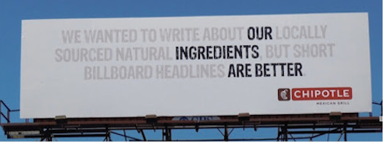
CHOOSE YOUR WORDS CAREFULLY
The messaging on your signs may be the most important component. Your audience will most likely be reading the copy in passing, so you want people to understand the purpose of your sign right away. You also want your words to catch the person’s attention so that they stop and notice.
Follow these tips to make sure your message is as effective as possible:
- Keep sentences short to ensure that people will read them
- Use bold and simple fonts
- Include a clear call-to-action
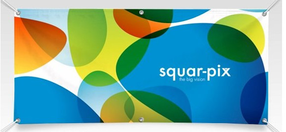
COLOR AND IMAGES
We live in a busy world where everything around us is competing for our attention. Accordingly, you need to design a sign that is going to stand out. One way to do this is to choose colors that evoke a certain feeling in consumers. While research suggests that some colors correlate with different emotions, make sure that the colors you choose align with your brand.

Whatever color scheme you decide on, the color of the text needs to stand out from the color of the background. Images can be more eye-catching but you need to decide if they are appropriate for the size of your printed signage and the personality of your brand. Be mindful that your images don’t distract from your messaging. And, of course, you must be sure that any selected images are high-resolution and will not look pixelated when enlarged.
KEEP IT SIMPLE
When in doubt, keep your design simple. Remember that this sign is something consumers will see most likely in passing; you want your message to jump out and stick with them.
