You ever get those Value-Pak mailers with a series of a cards from different businesses? I find myself compelled to open those mailings- expecting an offer too good to risk missing.
I typically am disappointed with what’s inside. But in a recent mailing I found myself so mesmerized by the awful presentation of the pitch on one card that I saved it for its instructional value.
Check this out! I see at 6 fixes to make to greatly improve the effectiveness of the piece:
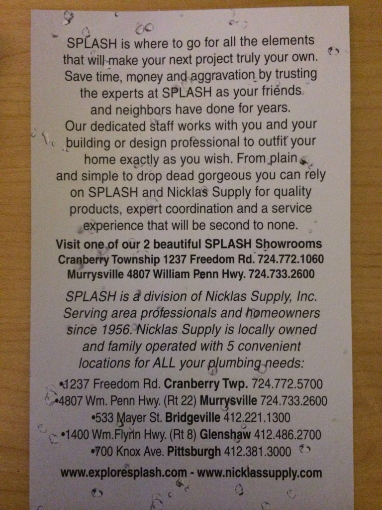
1. So much to say, so little space
It’s a lot easier to write lots of text as opposed to editing the copy down to be more concise.
Copy writing is straightforward: copy conveys to readers the campaign’s message plus it indicates the key points that the reader should focus on. This card has a sea of too-much text which does not clue us in on what is really important.
Lesson: too much copy/no images. Cut at least 40% of text.
2. No images
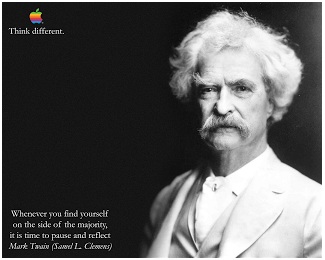
Most people prefer to consume messaging with images (not just text). And the best campaigns expertly mix copy and images (think of the Apple campaigns with Mark Twain and Gandhi).
While there is limited space on this side of the card to add an image, the designer could have laid out the 5 locations in a more cohesive, appealing table.
Lesson: Find a way to break up text with a compelling image.
3. Where are the headlines?
One of the ways copywriters indicate to readers what’s important is through headlines. They also lead a reader from the most important to least important points.
Lesson: call out ideas/key points with headlines
4. Make the call-to-action very clear
Every campaign should have a clear call-to-action. This ad does offer us one: “visit a showroom.” And the designer did use bold text to call attention to it.
But this copy is surrounded by a sea of text which makes it too hard to find.
Lesson: The call-to-action needs to be clearly visible to the reader.
5. Are listing 2 websites better than one?
Marketers need to lead their readers in a clear direction. The card gives two websites on the same line. Which one should the reader visit? And why?
Lesson: Don’t confuse the reader. Give them one clear path to what you want them to do.
6. Why is the text center justified?
The designer set the copy up as center justified -all copy is centered on an imaginary vertical line in the center of the card. The the effect is jagged copy on the left edge. Given that we read left-to-right, this approach makes it hard to read.
I like to set email campaigns as center justified when we have a focused set of copy and a compelling image. But not when the campaign is print-based and has so much copy.
Lesson: we read left-to-right. In general it is a good plan to start with formatting the text to the left- particularly with printed pieces.
Putting it all together: here are some basics to employ as you design your next piece:
- Less is more (especially with text)
- Compel with images and clear paths to the obvious offer
- Lead your reader from top to bottom and with headlines
I hope this supply business will employ these best practices in their next flyer.
